Holofoils
React UI Component
Inspired by the work of simeydotme and Paco Coursey.
Follow the directions below to start using holofoil cards in your own React or NEXT.js project. Customize the cards using your own images, component props, and custom styling. Checkout the gallery of examples below and continue reading to see the code.
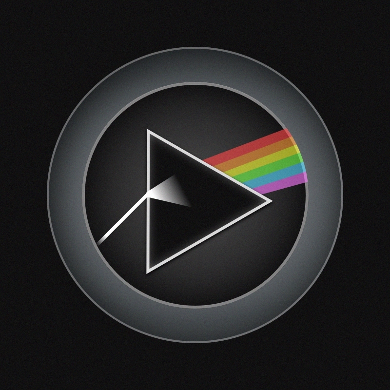
Pink Floyd Playbutton

Bitcoin
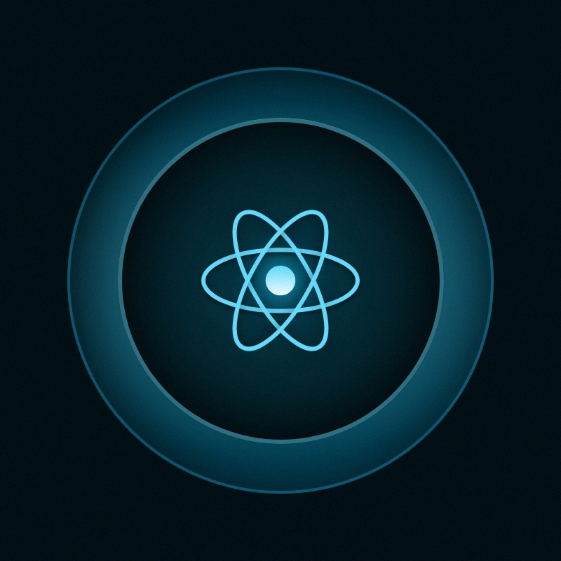
React.js
Steps
- Create a file called,
HolofoilTemplate.jsxin the /components folder. - Copy the code below and paste it into the new component file. Note, if using VS Code, press Shift+Alt+F for Windows (Cmd+k+f for Mac) to quickly fix any formatting issues.
- Add a main, foreground image to the public folder. Add the absolute url string to the
foregroundImageprop of the HolofoilTemplate.jsx component. There is a code comment in the desctructured props pointing to the correct place to put the url. - In the same folder as the component, create a second file called,
HolofoilTemplate.module.css - Copy the code below and paste it into the new component file.
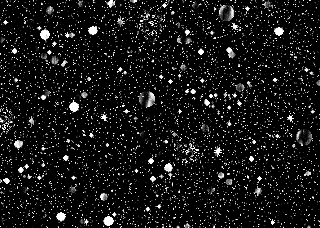
- Add a background image to the public folder. Note: A good background image typically consists of a random or repeating white pattern on a black background.
- Add the relative url pointing to the background image, to the
--patternCSS variable (found within the.foilclass). There is a code comment in the CSS pointing to the correct place to put the url. - Import and add the
<HolofoilTemplate />component to a page. Hover over the holofoil and see how it works!
/src/components/HolofoilTemplate.jsx
    import { useState, useRef } from "react";
    import styles from "./HolofoilTemplate.module.css"

    export default function HolofoilTemplate(props) {

        const {
            width = 500,
            height = 300,
            perspective = 600,
            radius = 20,
            foregroundImage = '/replace-me.jpg', // <-- Insert your own image
            opacity = 0.4,
            rotateX = 20,
            rotateY = 15,
            shimmerRate = 30,
        } = props

        const [ holoCoordinates, setHoloCoordinates ] = useState({
            mx: 50, my: 50,
            bx: 50, by: 50,
            rx: 0, ry: 0,
            opacity
        })

        let bounds;
        const inputRef = useRef();

        const rotateToMouse = (e) => {
            bounds = inputRef.current.getBoundingClientRect();
            const mouseX = e.clientX;
            const mouseY = e.clientY;
            const leftX = mouseX - bounds.x;
            const topY = mouseY - bounds.y;
            const center = {
                x: leftX - bounds.width / 2,
                y: topY - bounds.height / 2,
            };

            setHoloCoordinates({
                mx: (leftX/bounds.width)*100,
                my: (topY/bounds.height)*100,
                bx: (leftX+bounds.width)/(bounds.width/shimmerRate),
                by: (topY+bounds.height)/(bounds.height/shimmerRate),
                rx: (center.x)/((bounds.right-bounds.left) / (2*rotateX)),
                ry: (center.y)/((bounds.bottom-bounds.top) / (2*rotateY)),
                opacity: 1,
            })

        };

        const removeListener = (e) => {
            setHoloCoordinates({
                mx: 50, my: 50,
                bx: 50, by: 50,
                rx: 0, ry: 0,
                opacity
            })
        };

        return (
            <div
                className={styles.container}
                style={{
                    "--width": `${width}px`,
                    "--height": `${height}px`,
                }}
            >
                <div
                    className={styles.variables}
                    style={{
                        "--m-x": `${holoCoordinates.mx}%`,
                        "--m-y": `${holoCoordinates.my}%`,
                        "--bg-x": `${holoCoordinates.bx}%`,
                        "--bg-y": `${holoCoordinates.by}%`,
                        "--r-x": `${holoCoordinates.rx}deg`,
                        "--r-y": `${holoCoordinates.ry}deg`,
                        "--radius": `${radius}px`,
                        "--opacity": `${holoCoordinates.opacity}`,
                        "--perspective": `${perspective}px`,
                    }}
                    ref={inputRef}
                    onMouseLeave={removeListener}
                    onMouseMove={rotateToMouse}
                >
                    <div className={styles.card}>
                        <div className={styles.imageContainer}>
                            <img
                                src={foregroundImage}
                                className={styles.image}
                                style={{ color:"transparent" }}
                                alt="holofoil main image"
                            />
                        </div>
                        <div className={styles.cursourHighlight}></div>
                        <div className={styles.foil}></div>
                    </div>
                </div>
            </div>
        );
    }
/src/components/HolofoilTemplate.module.css
    .container {
        --width: 480px;
        --height: 300px;
        width: var(--width);
        height: var(--height);
    }

    .variables {
        --m-x: 50%;
        --m-y: 50%;
        --r-x: 0deg;
        --r-y: 0deg;
        --bg-x: 50%;
        --bg-y: 50%;
        --radius: 0px;
        --perspective: 600px;
        --opacity: .5;
        --duration: 300ms;
        --foil-size: 75%;
        --easing: ease;
        --transition: var(--duration) var(--easing);
        position: relative;
        isolation: isolate;
        contain: layout style;
        perspective: var(--perspective);
        transition-property: transform;
        will-change: transform;
        width: 100%;
        height: 100%;
    }

    .card {
        height: 100%;
        display: grid;
        will-change: transform;
        transform-origin: center center;
        transition-duration: 200ms;
        transition-property: transform;
        transform: rotateY(var(--r-x)) rotateX(var(--r-y));
        border-radius: var(--radius);
        border-width: 1px;
        border-style: solid;
        border-color: rgb(28, 28, 28);
        border-image: initial;
    }

    .card > * {
        width: 100%;
        height: 100%;
        display: grid;
        grid-area: 1 / 1 / auto / auto;
        clip-path: inset(0 0 0 0 round var(--radius));
    }

    .imageContainer {
        position: relative;
        width: 100%;
        height: 100%;
        overflow: hidden;
    }

    .image {
        object-fit: cover;
    }

    .cursourHighlight {
        mix-blend-mode: soft-light;
        opacity: var(--opacity);
        will-change: background;
        transition-property: opacity, background;
        background:
            radial-gradient(
                farthest-corner circle at var(--m-x) var(--m-y),
                rgba(255,255,255,0.8) 10%,
                rgba(255,255,255,0.65) 20%,
                rgba(255,255,255,0)
            90% );
    }

    .foil {
        mix-blend-mode: color-dodge;
        opacity: var(--opacity);
        will-change: background;
        transition-property: opacity;
        clip-path: inset(0 0 1px 0 round var(--radius));
        --step: 5%;
        /* Insert your own image into the url below */
        --pattern: url('../public/replace-me.jpg') center / var(--foil-size);
        --rainbow:
            repeating-linear-gradient(
                0deg,
                rgb(255,119,115) calc(var(--step) * 1),
                rgba(255,237,95,1) calc(var(--step) * 2),
                rgba(168,255,95,1) calc(var(--step) * 3),
                rgba(131,255,247,1) calc(var(--step) * 4),
                rgba(120,148,255,1) calc(var(--step) * 5),
                rgb(216,117,255) calc(var(--step) * 6),
                rgb(255,119,115) calc(var(--step) * 7)
            ) 0% var(--bg-y) / 200% 700%;
        --diagonal:
            repeating-linear-gradient(
                128deg,
                #0e152e 0%,
                hsl(180,10%,60%) 3.8%,
                hsl(180,10%,60%) 4.5%,
                hsl(180,10%,60%) 5.2%,
                #0e152e 10%,
                #0e152e 12%
            ) var(--bg-x) var(--bg-y) / 300%;
        --shade:
            radial-gradient(
                farthest-corner circle at var(--m-x) var(--m-y),
                rgba(255,255,255,0.1) 12%,
                rgba(255,255,255,0.15) 20%,
                rgba(255,255,255,0.25) 120%
            ) var(--bg-x) var(--bg-y) / 300%;
        background-blend-mode: hue, hue, hard-light, overlay;
        background:
            var(--pattern),
            var(--rainbow),
            var(--diagonal),
            var(--shade);
    }

    .foil::after {
        content: "";
        grid-area: inherit;
        background-image: inherit;
        background-repeat: inherit;
        background-attachment: inherit;
        background-origin: inherit;
        background-clip: inherit;
        background-color: inherit;
        mix-blend-mode: exclusion;
        background-size:
            var(--foil-size),
            200% 400%,
            800%,
            200%;
        background-position:
            center,
            0% var(--bg-y),
            calc(var(--bg-x) * -1) calc(var(--bg-y) * -1),
            var(--bg-x) var(--bg-y);
        background-blend-mode: soft-light, hue, hard-light;
    }

Future Enhancements
- Set the background image in props instead of manually in CSS.
- Stack multiple layers of foreground images and apply the “foil” effect only to specific layers (specified with a prop).
- Fix the CSS properties causing clunky pitch (x-axis) and yaw (y-axis) rotation animations in the Mozilla browser.